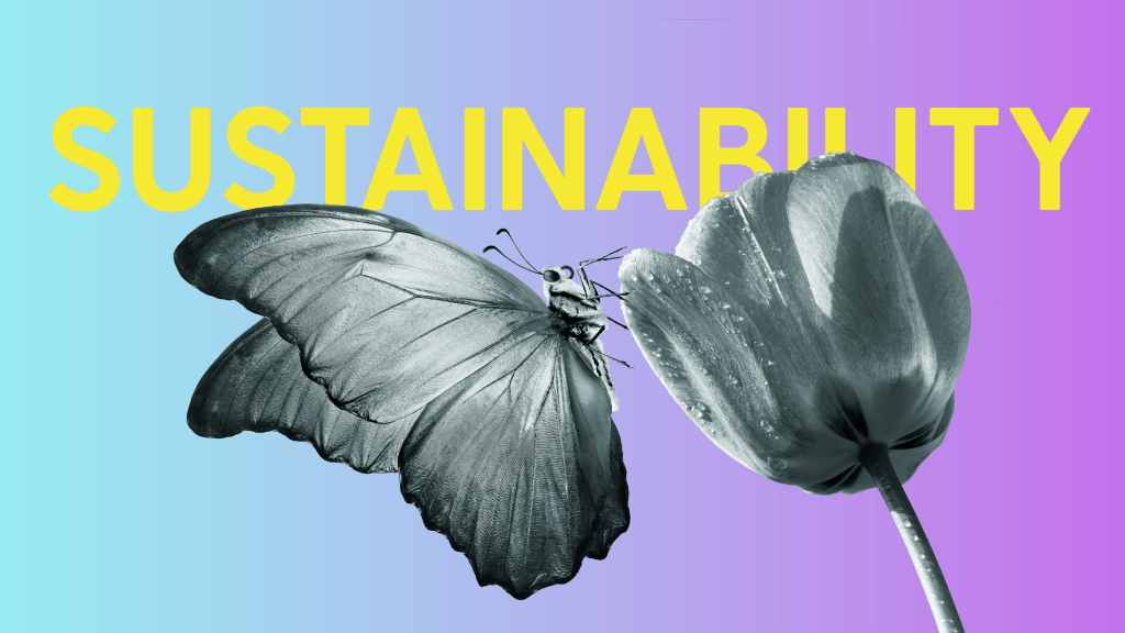
Branding sustainable businesses better to communicate the important missions to the stakeholders. Check our social impact projects.
CASE STUDY: SUSTAINABLE ENERGY
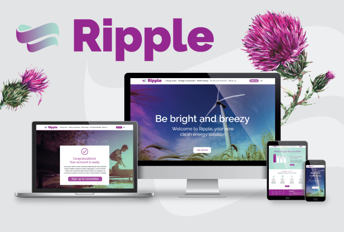
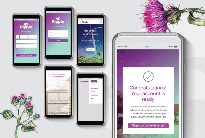
RIPPLE ENERGY
Location: UK
Brand identity and UI design for Ripple Energy, the first crowd-funded wind turbine in the UK history. The brand colours are inspired by thistle flowers that grow on the location of the wind turbines in Scotland. The campaign successfully secured investors funding.
CASE STUDY: CLIMATE CHANGE COACHING & BUSINESS COACHING
MARK ELLIOTT COACHING
Location: UK
Art direction and extended brand identity system for Mark Elliott Coaching covering the website design, e-newsletter design and presentations. Elliott is also a climate change coach, who co-founded The Startup School for Seniors – a trailblazing initiative to support over-50s setting up their own businesses.

CASE STUDY: SUSTAINABILITY, SUSTAINABLE LOCAL ECONOMY, SOCIAL DEVELOPMENT
BIJI-BIJI INITIATIVE
Location: Malaysia
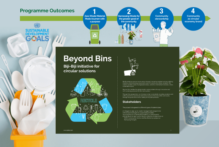
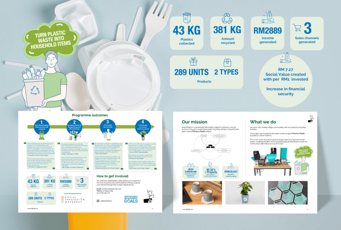
Social Innovation Movement, the management partner for Beyond Bins project, has commissioned our studio to design an investor and stakeholder document, featuring infographics and art direction proposals.
Beyond Bins is a programme by Biji-Biji Initiative to tackle the global plastic waste problem through innovative and self-sustaining solutions for the communities. The project was inspired by the open-source project Precious Plastic founded by Dave Hakkens.
CASE STUDY: SUSTAINABLE LOCAL ECONOMY, SOCIAL DEVELOPMENT
GRITse & BRUNEL UNIVERSITY
Location: UK, Malaysia Borneo
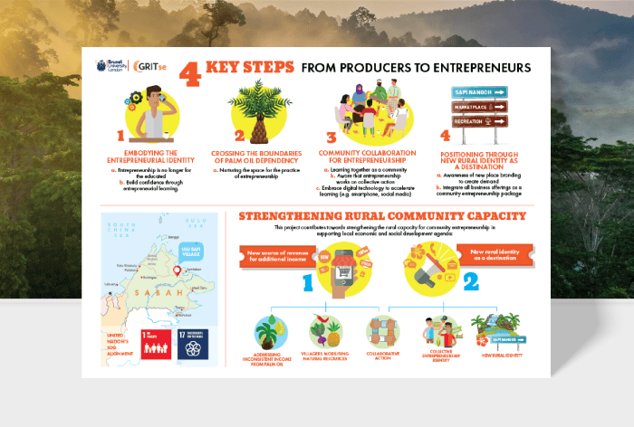
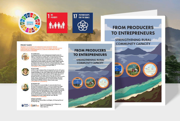
The Sapi Nangoh infographic, commissioned by GRITse and Brunel University, is a campaign to inform and educate stakeholders about their community entrepreneurship and branding effort at Ulu Sapi village, Sabah, Malaysia (Borneo).
The project contributes towards strengthening the rural capacity for community entrepreneurship. Some of the key steps involve crossing the boundaries of palm oil dependencies and repositioning the village as a destination.
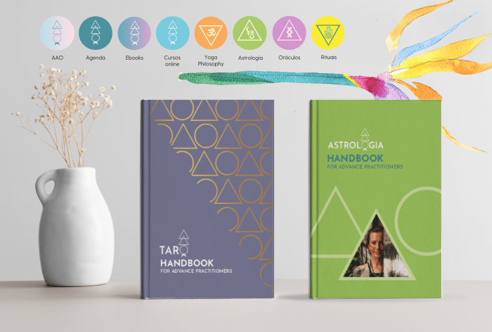
CASE STUDY: WELLNESS SECTOR, TRAINING & UPSKILLING
ACADEMIA DE ARTE ORECULAR
Location: Brazil
Brand identity system and campaign design for Academia de Arte Oracular yoga academy based in Brazil. The colour palette is inspired the the coastal water of Rio de Janeiro. Applying fresh interpretations of oracle symbols on UI design, to convey holistic message via tech medium. The identity system covers teaching guides, communication channels and programmes signposting.

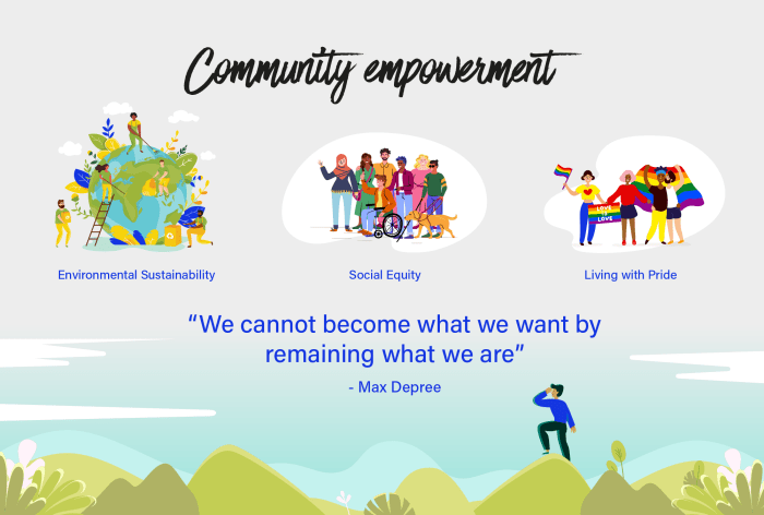
Check out our projects by categories below:
Check out the Design Cities Series, a collection of inspiring entrepreneur interviews, wellness, tech and sustainability reports to help businesses navigate the future better.


You must be logged in to post a comment.